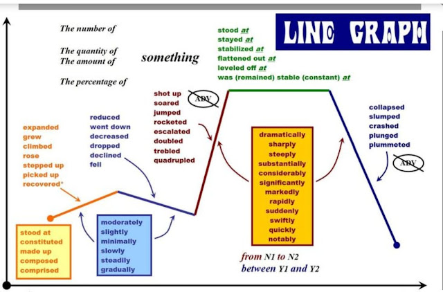
In the last few days, we have been working on how to write a visual data description.

While correcting your descriptions I have noticed that some of you simply make a summary of what the chart or graph illustrates. It is very important to remember that the reader of our description has also access to these graphs, so they expect us to highlight any surprising aspects of these visual data.
In order to do so, we are going to use certain verbs and adverbs which help us express not only the data found in these graphs, but also underline those aspects in which we want to call our reader's attention. However, avoid giving personal opinion about the reasons behind the given data (e.g. if the graph shows falling prices and you know it's because of the Covid'19, do not say anything. Your personal opinion must not be mentioned).
Always pay attention to the time frame of the graph or pine charts and use appropriate tenses (past, present or future). The use of the right prepositions is also important.
Another important tip is to focus on getting the appropriate data from the pie charts / graphs into your writing (major trends, major groups, exceptions...).
Finally, one important tip: try to see the big picture, avoid getting lost in very small details. After all, this is a summarizing task of mediation.
 For more tips and activities, go to this link by the British Council and complete the multiple choice gap filling activities at the end of the page. Check this vocabulary to help you with pie charts (language of portions) and line graphs.


No comments:
Post a Comment
Note: only a member of this blog may post a comment.